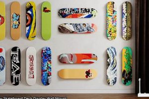
Visual artistry applied to skateboard platforms represents a significant aspect of skateboarding culture. These graphics range from simple logos to complex illustrations and serve as a form of self-expression for skaters and a canvas for artists. Consider a deck featuring intricate line work depicting a stylized cityscape, a far cry from a basic, single-color design. This illustrates the breadth of creative possibilities inherent in this visual medium.
The aesthetic presentation of skateboards holds considerable importance, impacting brand identity and skater individuality. Historically, deck graphics evolved from functional markings to elaborate artworks reflecting broader cultural trends in art, music, and fashion. The perceived value can be enhanced due to the artist’s reputation or the limited availability of the design, becoming collectibles in some instances.
The following sections will examine various design elements that contribute to visually compelling skateboard aesthetics, including notable artists, impactful styles, and the influence of technology on creating these personalized pieces of equipment.
Design Considerations for Skate Decks
Optimizing the visual appeal of skate decks involves careful consideration of various design elements and production techniques. A well-executed design can enhance a brand’s image and resonate with the target audience.
Tip 1: Employ High-Resolution Imagery: Utilizing high-resolution images ensures clarity and detail in the final product. Low-resolution graphics can appear pixelated, diminishing the overall aesthetic quality. For example, source images at a minimum of 300 DPI.
Tip 2: Consider Color Palette: The selection of a complementary and visually appealing color palette is crucial. Contrasting colors can create visual interest, while analogous colors can evoke a sense of harmony. Refer to established color theory principles for optimal results.
Tip 3: Leverage Typography Effectively: Employ typography that aligns with the deck’s overall aesthetic and brand identity. The font choice, size, and placement should enhance readability and visual impact. Avoid cluttered or overly ornate fonts that detract from the design.
Tip 4: Explore Graphic Styles: Consider various graphic styles, such as minimalist, abstract, illustrative, or photographic. The chosen style should resonate with the target audience and complement the skateboarding style the deck is intended for.
Tip 5: Optimize Print Production: Understand the limitations and capabilities of the printing process. Screen printing, heat transfer, and direct digital printing each offer distinct advantages and disadvantages in terms of color accuracy, durability, and detail. Consult with printing professionals to determine the most suitable method.
Tip 6: Account for Deck Shape and Contours: The curvature and shape of the deck will affect how the design is perceived. Consider wrapping the design around the edges or using elements that complement the deck’s contours.
Tip 7: Review Existing Trends: While originality is valued, researching current trends in skateboard deck design can provide valuable insights and inspiration. However, avoid direct replication and strive for unique interpretations.
Adhering to these design considerations can result in visually compelling skate decks that effectively communicate a brand’s message and appeal to skateboarders.
The subsequent sections will explore specific examples of successful designs and further discuss the impact of these visuals on the skateboarding community.
1. Graphic Complexity
Graphic complexity in skateboard deck design refers to the level of detail and intricacy present in the visual elements applied to the deck’s surface. This characteristic directly impacts the perceived value and aesthetic appeal. Decks featuring high graphic complexity, such as detailed illustrations or intricate patterns, often command a higher market value and appeal to skaters seeking self-expression through their equipment. A design incorporating multiple layers of imagery, gradients, and fine lines demands advanced printing techniques and often translates to a more visually arresting product. For instance, decks featuring collaborative artwork with established artists frequently utilize complex designs to showcase the artist’s skill and vision, therefore increasing collectibility.
Conversely, designs with minimal graphic complexity, such as simple logos or monochromatic color schemes, can emphasize brand identity and offer a clean, understated aesthetic. The choice between high or low graphic complexity depends heavily on the target audience and the overall brand strategy. A deck featuring a complex, chaotic design may resonate with a subculture emphasizing rebellious expression, while a minimalist design might appeal to skaters who prioritize functionality and a streamlined aesthetic. The selection of graphic complexity must therefore align with the intended brand image.
Ultimately, graphic complexity serves as a significant differentiating factor in skateboard deck design. Its skillful implementation can enhance a deck’s visual impact, brand recognition, and market value. The balance between graphic complexity and overall design coherence remains a critical factor in the creation of successful skateboard decks, impacting both aesthetic appeal and brand messaging.
2. Color Palette
The color palette employed in skateboard deck design is a critical determinant of aesthetic appeal and brand recognition. Color choices influence consumer perception and can evoke specific emotions or associations. A carefully selected palette, therefore, directly contributes to the success of a deck design. For example, a skateboarding brand targeting a younger demographic may utilize vibrant, saturated colors like neon pinks and electric blues to project a sense of energy and playfulness. Conversely, a brand aiming for a more mature audience might opt for a palette of muted earth tones and sophisticated grays to convey a sense of timelessness and refined style.
The impact of color extends beyond simple aesthetics. Color combinations can create visual hierarchy, drawing attention to specific design elements, such as a brand logo or a central illustration. The strategic use of contrasting colors can enhance readability and make the design more memorable. For instance, a skate deck featuring a complex black and white illustration may incorporate a single, bright accent color to highlight the brand name and create a focal point. Furthermore, the color palette must be compatible with the chosen printing method, as some colors may appear differently depending on the printing technique. A design intended for screen printing, for example, may require adjustments to ensure color accuracy and vibrancy.
In conclusion, the color palette is an integral component of effective skateboard deck designs. Its careful selection, considering target demographics, brand identity, and printing limitations, is essential for creating visually compelling and marketable products. Ignoring the importance of color can significantly detract from an otherwise well-executed design, ultimately affecting sales and brand perception. Thus, the thoughtful application of color theory and trend analysis is crucial for any designer aiming to create successful skateboard deck graphics.
3. Artistic Style
Artistic style is a fundamental component contributing to the aesthetic value and cultural significance of skateboard deck designs. The choice of artistic style directly influences the visual impact, target audience appeal, and overall brand identity.
- Realism
Realism involves depicting subjects in a lifelike manner, often employing detailed illustrations or photographs. In skate deck design, realism can be seen in depictions of iconic skaters, landmarks, or nature scenes. The execution often demands high-resolution imagery and skilled rendering techniques. The resulting decks can appeal to those who appreciate technical skill and recognizable imagery.
- Abstract Expressionism
Abstract expressionism utilizes non-representational forms, colors, and textures to convey emotion and artistic expression. In the context of skate decks, this may involve splatters, drips, and gestural marks devoid of clear subject matter. This style offers freedom in design and allows for unique, visually striking decks that resonate with skaters seeking unconventional aesthetics.
- Pop Art
Pop Art incorporates imagery from popular culture, such as comic books, advertising, and celebrity portraits. Applied to skate decks, Pop Art designs often feature bold colors, graphic elements, and satirical commentary. This style tends to resonate with skaters who appreciate irony, cultural references, and a visually loud aesthetic.
- Geometric Abstraction
Geometric abstraction emphasizes the use of geometric shapes, lines, and patterns to create visually intriguing designs. Skate decks employing this style often feature symmetrical compositions, tessellations, or optical illusions. These designs can appeal to skaters who appreciate precision, mathematical beauty, and a modern aesthetic.
The selection of an appropriate artistic style is integral to creating visually compelling skateboard deck designs. Each style offers unique advantages in terms of aesthetic expression, target audience appeal, and brand identity. Therefore, careful consideration of the desired aesthetic and target market is essential when choosing an artistic style for a skateboard deck design. The combination of artistic style and skating lifestyle is important and make an impression to target market.
4. Brand Identity
Brand identity and skateboard deck aesthetics are intrinsically linked; the designs on a deck serve as a primary visual representation of a brand’s values, target demographic, and overall image. Effective deck designs amplify brand recognition and foster customer loyalty. Conversely, poorly conceived graphics can dilute brand perception and alienate potential customers. Brand identity is a cause of best skate deck designs, because best skate deck designs is build brand image and recognition. For example, a skateboard company emphasizing environmental sustainability might feature deck designs incorporating nature-themed illustrations or utilize recycled materials in the deck construction itself. This tangible representation reinforces the brand’s commitment to its core values, attracting environmentally conscious skaters.
The importance of brand identity in deck designs extends to practical marketing strategies. A cohesive visual language across all products, including decks, apparel, and accessories, creates a unified brand experience. This consistent messaging strengthens brand recall and allows customers to readily identify and associate with the company. Consider the consistent use of bold, geometric patterns and a restricted color palette by certain skateboard brands, instantly recognizable and reinforcing their distinct style. Furthermore, limited-edition deck collaborations with renowned artists or influential figures in skateboarding can generate considerable buzz and elevate a brand’s prestige, provided the collaboration aligns with the established brand identity.
In summary, brand identity is not merely a superficial element in skateboard deck design but a crucial component that shapes consumer perception and drives brand loyalty. Successfully integrating brand values, target demographic considerations, and a cohesive visual language into deck graphics presents a significant challenge for skateboard companies. However, mastering this integration yields substantial benefits, including enhanced brand recognition, increased customer loyalty, and a stronger competitive advantage in the marketplace. The best skate deck designs is to build strong brand image.
5. Material Durability
Material durability plays a pivotal role in defining aesthetically pleasing skateboard decks. A visually striking design is rendered ineffective if the underlying structure fails to withstand the stresses of skateboarding. The relationship between material quality and design longevity is direct; superior materials extend the lifespan of both the deck and its graphic elements. Delamination, cracking, and graphic abrasion compromise the initial visual appeal, irrespective of the artistic merit. For instance, a deck constructed from seven plies of high-quality maple, treated with a durable sealant, will maintain its structural integrity and graphic clarity for a longer duration compared to a deck made from inferior materials. Therefore, material durability constitutes a crucial component of what is considered a high-quality or aesthetically pleasing skateboard deck.
The selection of appropriate materials also influences the printing process and graphic application. Decks intended for screen printing, for example, require a smooth, uniform surface to ensure consistent ink adhesion and color vibrancy. Variations in wood density or surface imperfections can lead to uneven printing, compromising the overall design. Heat-transfer graphics require materials capable of withstanding high temperatures without warping or distorting the image. Consequently, manufacturers must carefully consider the material properties of the deck in relation to the chosen graphic application technique. The interdependency between material quality and design implementation underscores the importance of a holistic approach to skateboard deck design and manufacturing.
In conclusion, material durability is not merely a functional consideration but an integral aspect of aesthetic longevity and design effectiveness. Selecting high-quality materials, appropriate for both structural integrity and graphic application, is essential for producing skateboard decks that retain their visual appeal over time. Ignoring the importance of material durability undermines the aesthetic effort, leading to premature degradation and diminished consumer satisfaction. Skateboard companies striving to produce what are considered “best skate deck designs” must prioritize both aesthetic creativity and material integrity.
Frequently Asked Questions
The following questions address common inquiries regarding the visual presentation of skateboard decks. These responses aim to provide clear, factual information for both consumers and industry professionals.
Question 1: What factors contribute to the longevity of a skateboard deck’s graphic design?
The lifespan of a skateboard deck graphic is influenced by several elements: the quality of the ink used, the application method (screen printing, heat transfer, digital printing), the number of protective clear coats applied, and the skater’s riding style. More durable inks, robust application techniques, and ample clear coats enhance resistance to abrasion.
Question 2: How does deck shape affect the visual impact of a design?
The concave, kicktail angles, and overall shape of a deck impact how a graphic is viewed and perceived. Designs should account for these contours to avoid distortion or visual imbalance. Some designs utilize the deck’s shape as an integral design element.
Question 3: Are there specific graphic design styles that are more popular among skateboarders?
Trends in skateboard deck graphics fluctuate, but certain styles consistently resonate with skaters. These include minimalist designs, illustrative artwork, pop art references, and designs reflecting current cultural trends in music, fashion, and art. Brand identity and skater subculture play significant roles in design preference.
Question 4: How important is the artist behind a deck design?
The artist’s reputation and skill can greatly influence the perceived value and collectibility of a skateboard deck. Collaborations with well-known artists often generate significant interest and demand, driving sales and enhancing brand prestige.
Question 5: What role does printing technology play in skateboard deck graphics?
Advancements in printing technology have expanded the possibilities for skateboard deck graphics. Digital printing allows for greater color accuracy, intricate details, and faster production times, while screen printing offers durability and vibrant colors. The choice of printing method depends on design complexity, budget constraints, and desired aesthetic qualities.
Question 6: Can copyright laws protect skateboard deck designs?
Original artwork featured on skateboard decks is subject to copyright protection. Unauthorized reproduction or distribution of copyrighted designs can result in legal action. Licensing agreements are common for collaborations between artists and skateboard companies.
In summary, the creation of a successful skateboard deck design requires consideration of material durability, printing technology, artistic style, brand identity, and legal considerations. A holistic approach to design and manufacturing is essential for producing decks that are both visually appealing and structurally sound.
The next section will explore the future trends in skateboard deck design and the impact of emerging technologies.
Conclusion
The preceding analysis elucidates the multifaceted nature of effective skateboard platform aesthetics. Elements spanning graphic complexity, color implementation, artistic styles, brand identity conveyance, and material endurance are not independent variables but rather interconnected constituents of a cohesive product. Attention to these facets yields decks with elevated market appeal and demonstrable value.
Continued evolution in materials and printing technologies promises further advancements in skateboard deck design. Brands that prioritize both visual innovation and structural integrity will likely achieve prolonged success. Diligence in aesthetic execution, coupled with an unwavering commitment to quality, remains paramount for manufacturers seeking to produce the most sought-after skateboard platforms.


![Buy the Best Toy Machine Skate Decks | [Year] Guide How to Skateboard: A Beginner's Guide to Your First Board & Tricks Buy the Best Toy Machine Skate Decks | [Year] Guide | How to Skateboard: A Beginner's Guide to Your First Board & Tricks](https://cruzskateshop.com/wp-content/uploads/2026/03/th-366-300x200.jpg)
